Duolingo Chat Feature
A student project, designing an additional feature for an existing app

Assignment
Student project for General Assembly's User Experience Design Immersive
Length
Two-week sprint
My Role
UX Designer- user research, visual design, prototyping, testing
Software Used
Zoom, Figma, Miro
Summary
This was a group assignment for General Assembly's User Experience Design Immersive. I worked with two other UX designers to find an existing app and design an additional feature for it. We chose Duolingo as the app we wanted to emulate, and upon research decided to add a chat feature for users/learners to talk to each other.
Discovery
We began with a competitive/comparative analysis. Duolingo had the market advantage of being free (though users have the option to pay to get more features), and that it is a good app for starting out in a new language.

We interviewed twelve language app users and found that they were frustrated with the single-faceted learning experience on Duolingo, and that they would like a better way to practice their target language.
We decided to add a feature where users can chat with a native speaker of their target language.
We created two user personas for the feature of our app based on interviews with people who already used Duolingo or a similar app. The first is someone who is about to travel internationally.
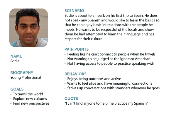

The second persona we created was for someone who has been abroad and studied the language but is getting rusty and needs the opportunity.

Our research told us that our users felt like Duolingo was the best app available for several reasons including the cost advantage, but were frustrated by repetition of some words/lessons, a lack of understanding grammar, and sentence examples that were nonsensical.
The problem for us was distilled down to our users needing a way to connect with native speakers while learning the language because when they travel they like to engage with locals and not feel like unwanted outsiders.
Constructing the Feature

Our next step was to construct a user flow showing how things would go as people used the feature that we were going to build, to give us a solid image of how we wanted it to go.
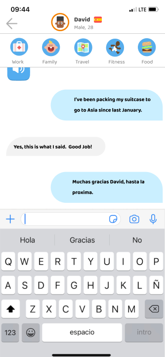
We built an asynchronous chat functionality, adding in a way for users to filter their partner choice by age and gender, and a way to view the other user's app statistics and interests on a profile page.


We then added in an Icebreaker feature that would read a sentence to the user and have them choose what words had been said by the app. This would be a topic that the two users can then chat about.

Iteration
Our first few usability tests did not go very smoothly, so we overhauled several interactions and placed some links differently before moving forward. We did a few more changes to make things move smoothly as we went on with usability testing, and the last few tests went well.
One of the changes we made was to enhance recognition by adding a blurred background behind a pop-up message. Another was to highlight a word by making it red and capitalized.


Next Steps and What We Learned
If this project were to be undertaken by Duolingo, there are some considerations that would need to be made. The biggest consideration is where the icon for the chat feature would be placed. We didn't want to bury it inside another feature, so we ended up removing the Newsfeed icon because Duolingo themselves have done that in the French module, to add an audio lessons tab.
We were ultimately pleased with our feedback. We feel that this is a feature that fits Duolingo's aesthetic, both in terms of the language learning and the visual standard.
We worked very well as a team. We also created a schedule for ourselves and managed to stay on schedule exactly as we had planned.
We struggled some with a few of the interactions we wanted to do and spent a long time learning how to make those interactions so that we could use them in our project.
The video on the right will take you through the feature.